
Makarun – Color, Flavor, and Energy in Space
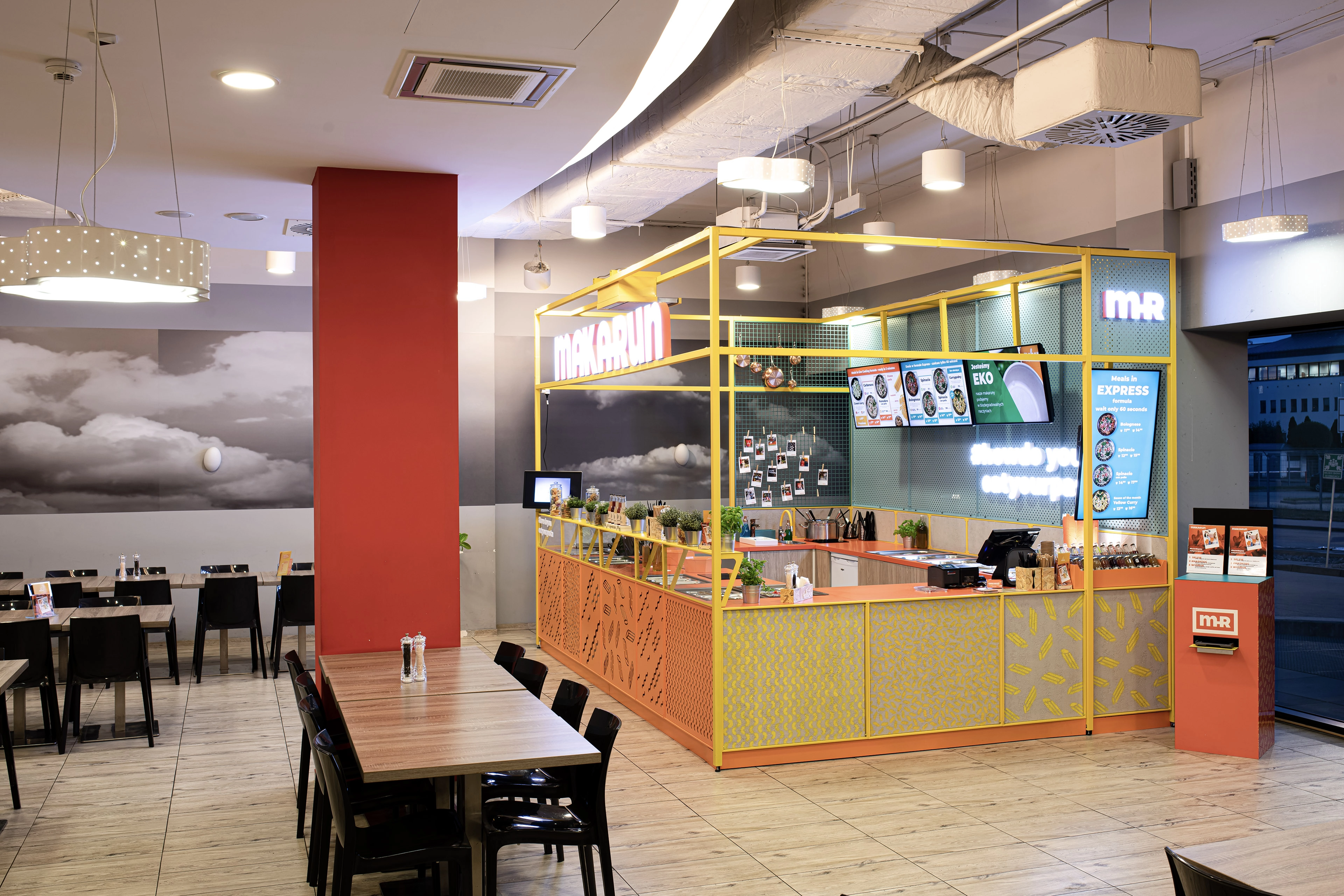
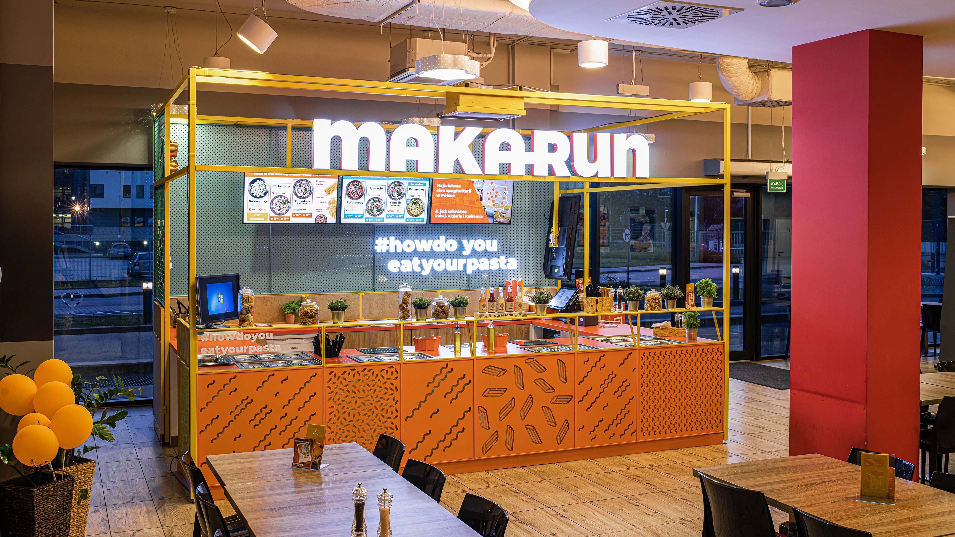
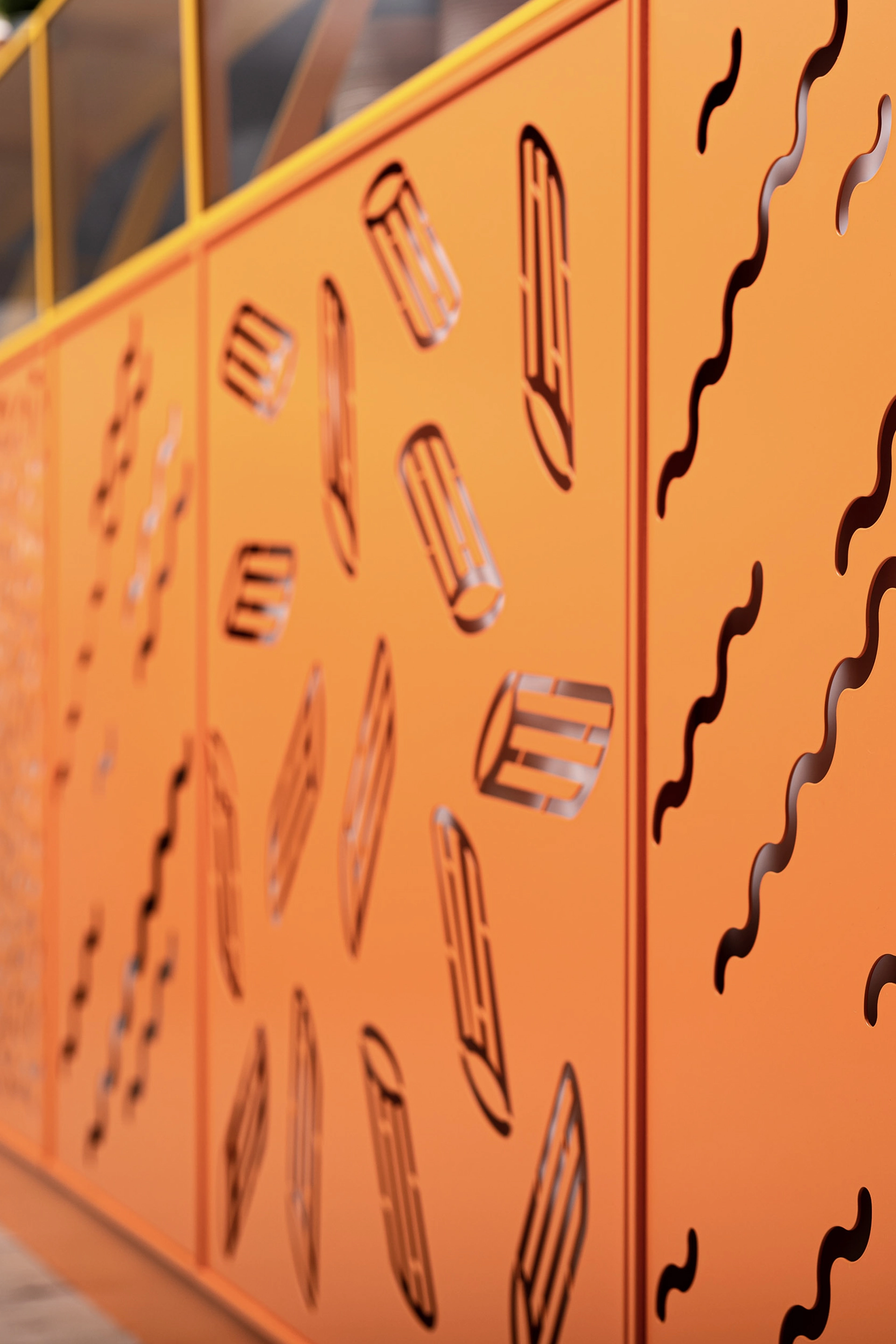
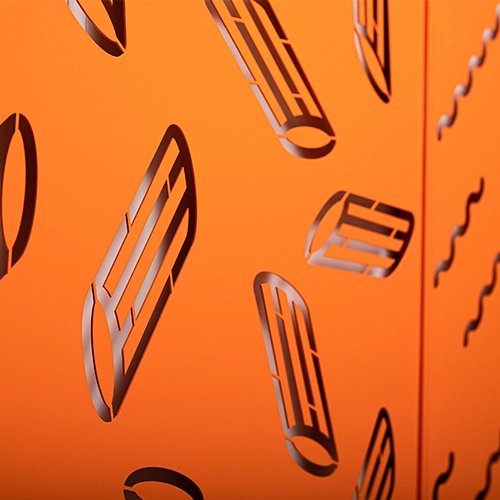
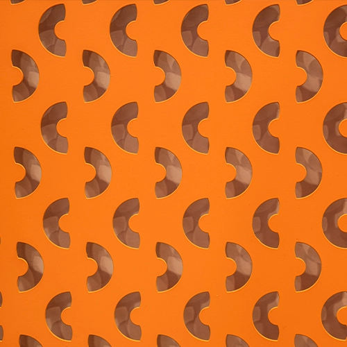
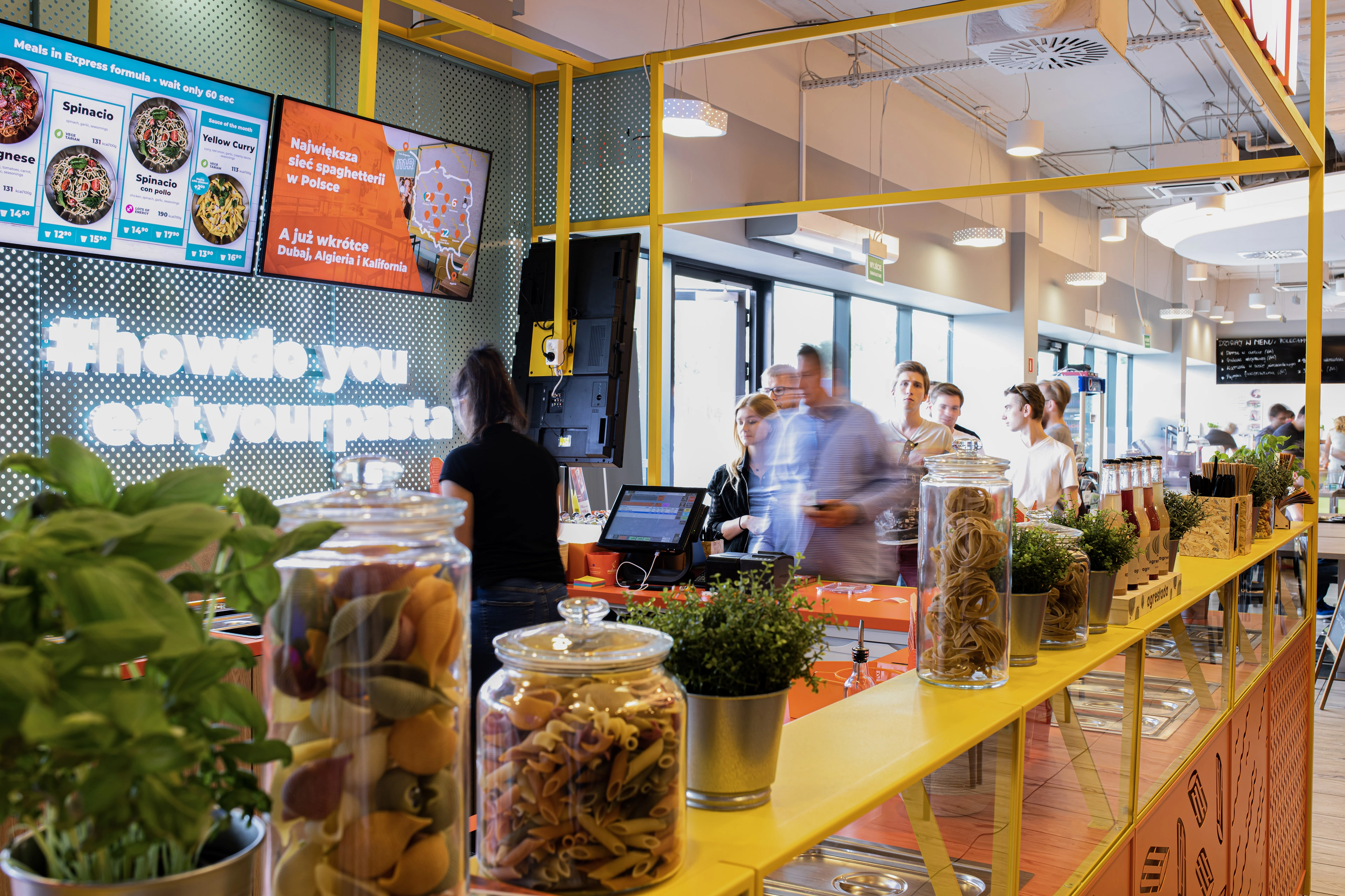
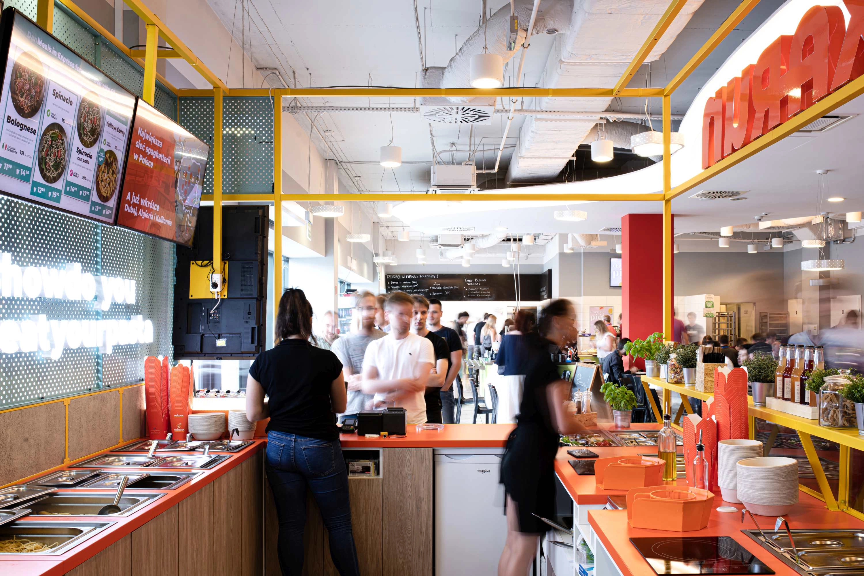
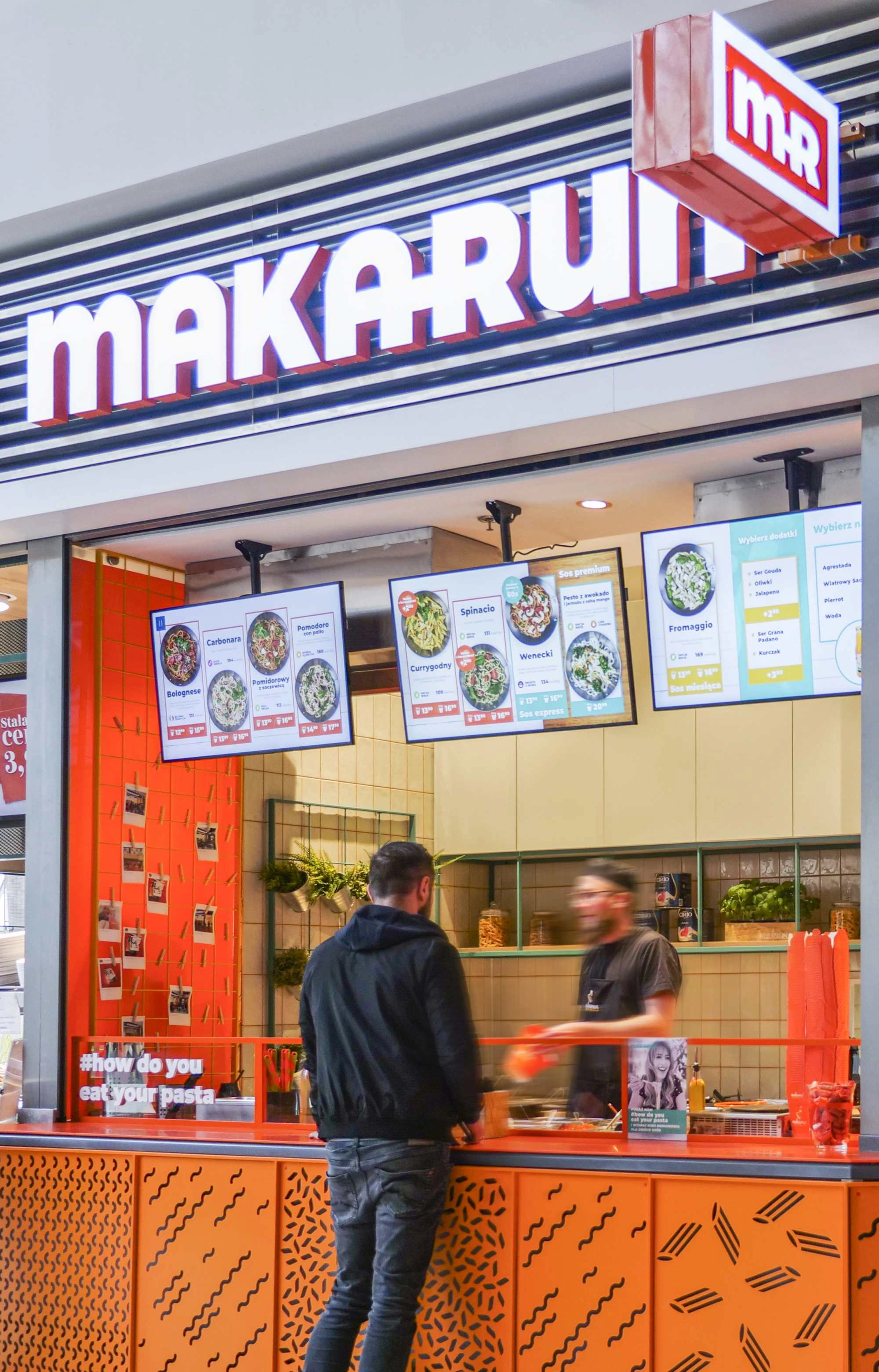
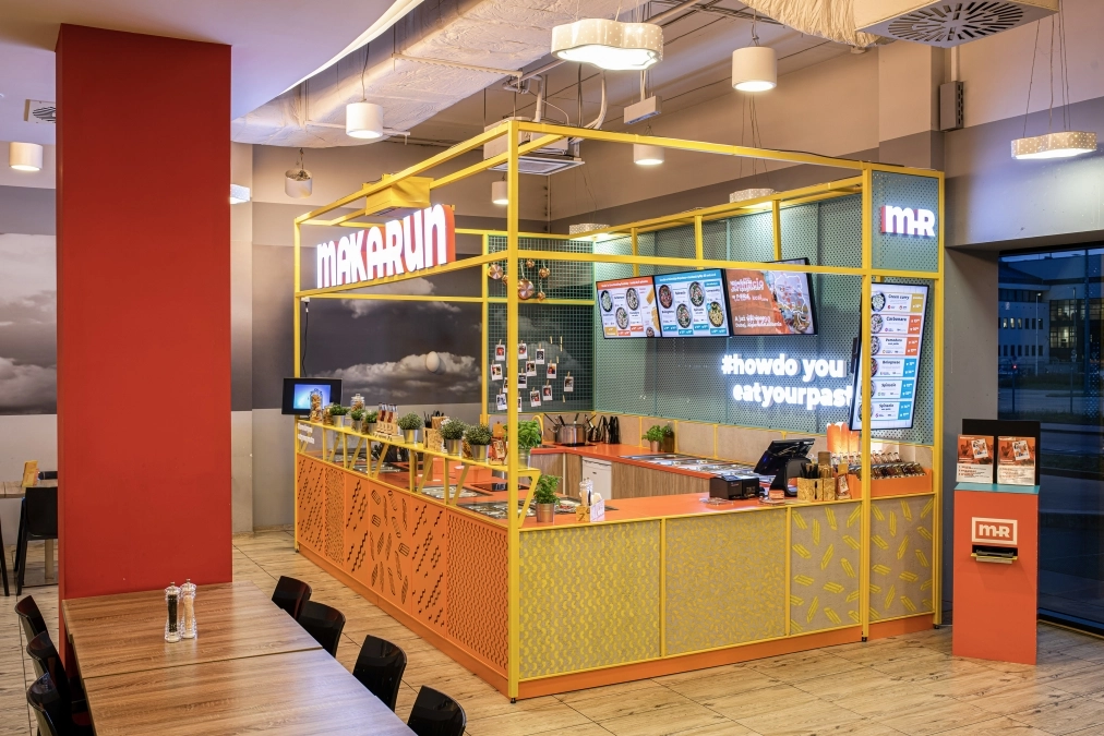
For the Makarun brand, we created an interior concept that fully reflects its distinctive, joyful, and energetic image. At the heart of the design are two key brand values – delicious pasta and the recognizable orange color, which became the dominant visual motif, building a strong spatial identity.
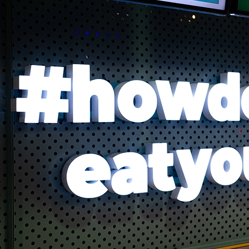
The concept was intended to reflect the brand’s vibrant and colorful communication style, which encourages interaction and fosters an emotional connection with the customer. The interior became a stage for positive experiences, where food is not just a need, but also a form of expression and play.
Great attention was given to the functional layout – optimizing customer flow, streamlining the ordering process, and reducing friction between staff and guests. A thoughtfully designed zoning and queue system ensures smooth and comfortable operation, even during peak hours.