Pure form, Technological Precision
For OT2S, a company specializing in IT outsourcing services, we designed a visual identity system that highlights its technological expertise and structured, professional approach.
The key objective was to create a minimalist identity that could be easily applied in everyday use – both in B2B communications and internal company materials. The branding was meant to convey not only modernity and precision but also transparency and trust – qualities essential in managing external IT infrastructure.
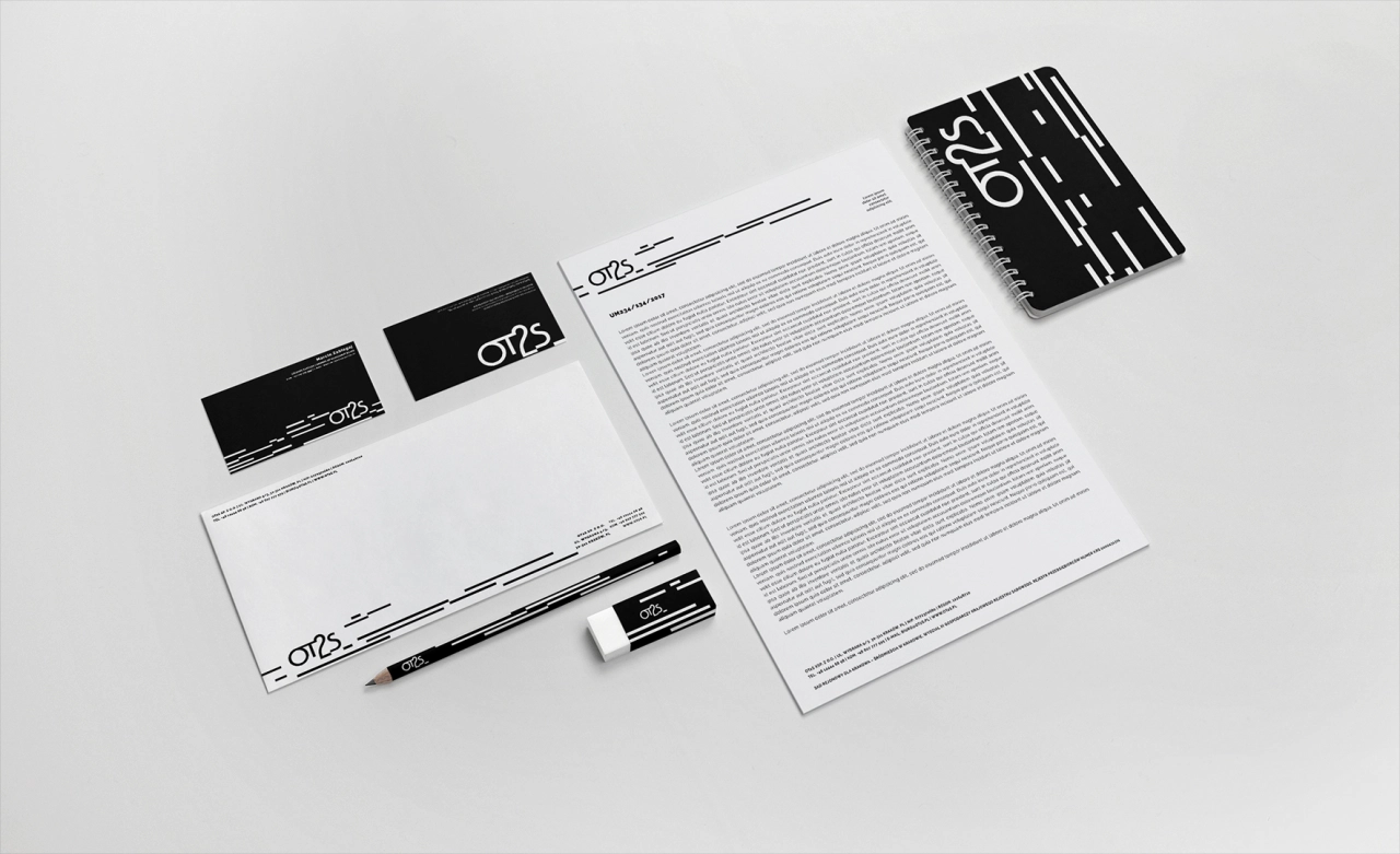
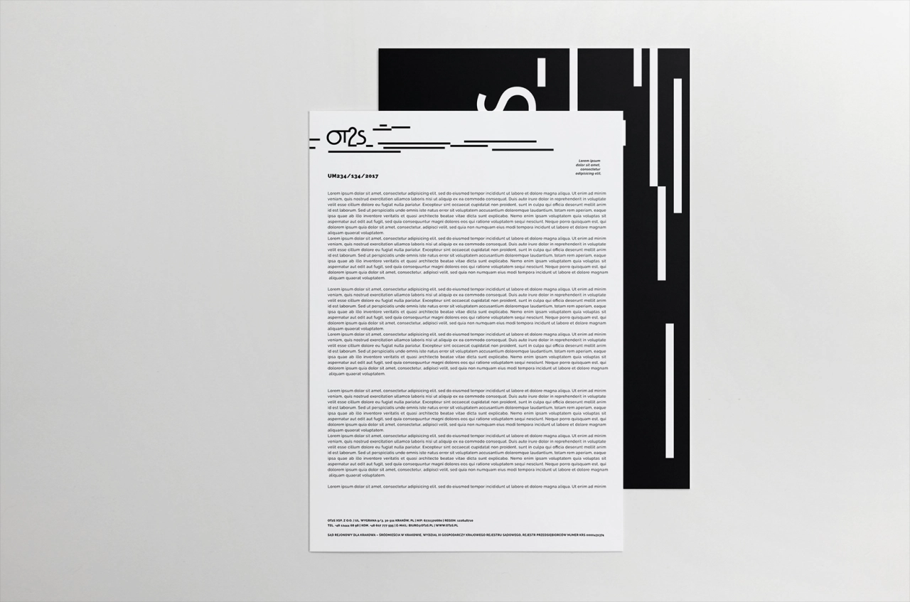
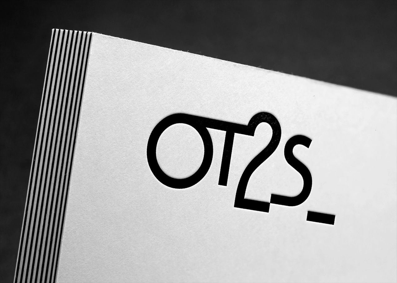
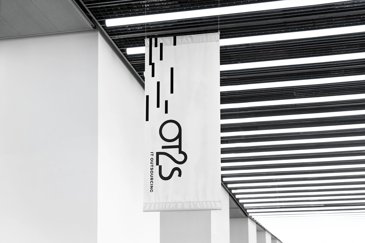
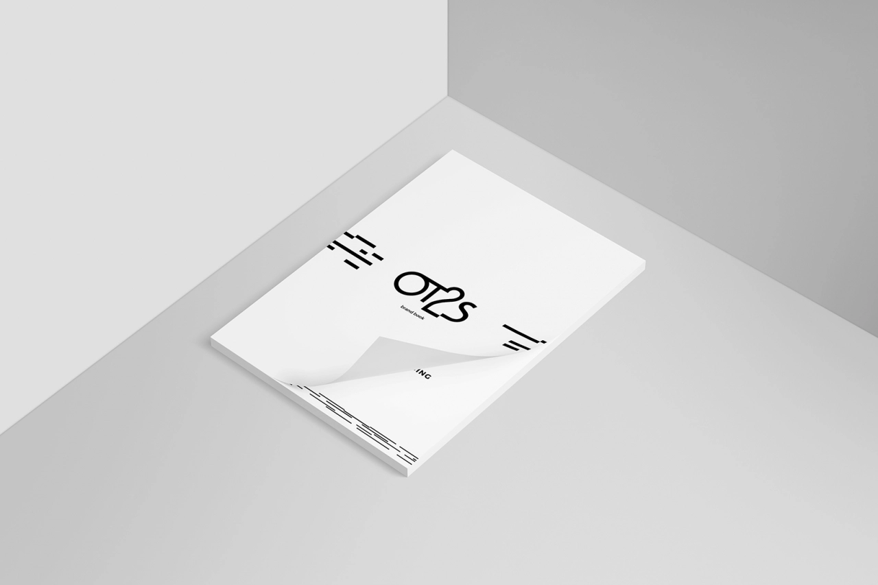
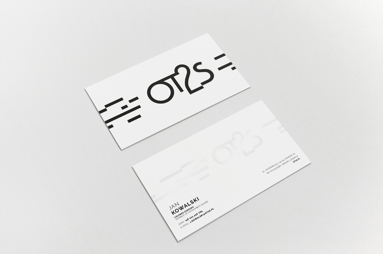
The OT2S logotype is a typographic mark based on simple, solid lines – geometric and free of embellishments, giving it a technical and orderly character. The absence of superfluous elements emphasizes a clear and reliable brand identity.
The entire identity is built around a monochromatic palette – black and white form a combination that offers both complete neutrality and excellent legibility across all formats. This aesthetic works particularly well in corporate environments, where clarity of message and functionality are key.
The design also incorporates subtle graphic elements – delicate lines and grid structures that introduce visual order and rhythm to printed materials (such as business cards, letterheads, and folders) as well as digital assets (presentations, documents, PDF templates). These modular details create a cohesive system that reinforces brand communication and ensures consistent recognition across all channels.
The result is a modern and structured visual identity that emphasizes strength, technological precision, and trust – without overpowering the content, but rather supporting it. The OT2S branding provides a solid foundation for scalable marketing efforts and building long-term relationships with business clients.